
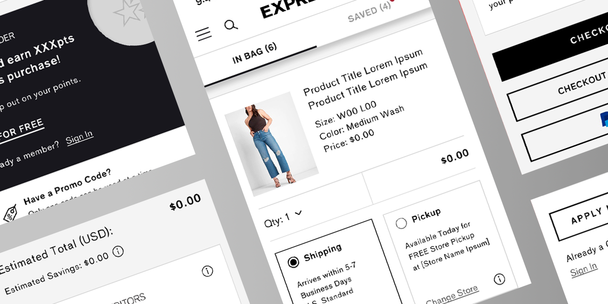
Express
Bag & Checkout Redesign
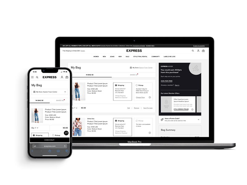
Checkout is the one screen where every extra step costs real money. I led a top-to-bottom redesign of the Express bag and checkout: cut the flow down to what's necessary, add the payment methods customers kept asking for, and make it work as well on a phone as on a desktop.
The Challenge
- Checkout had too many steps, and people gave up partway through
- A short list of payment options turned willing buyers away
- The bag never updated prices or stock in real time, so it felt unreliable
- Nothing in the flow pointed shoppers toward items that paired with their cart
- On mobile, where most of the traffic was, the whole thing felt clumsy
The Solution
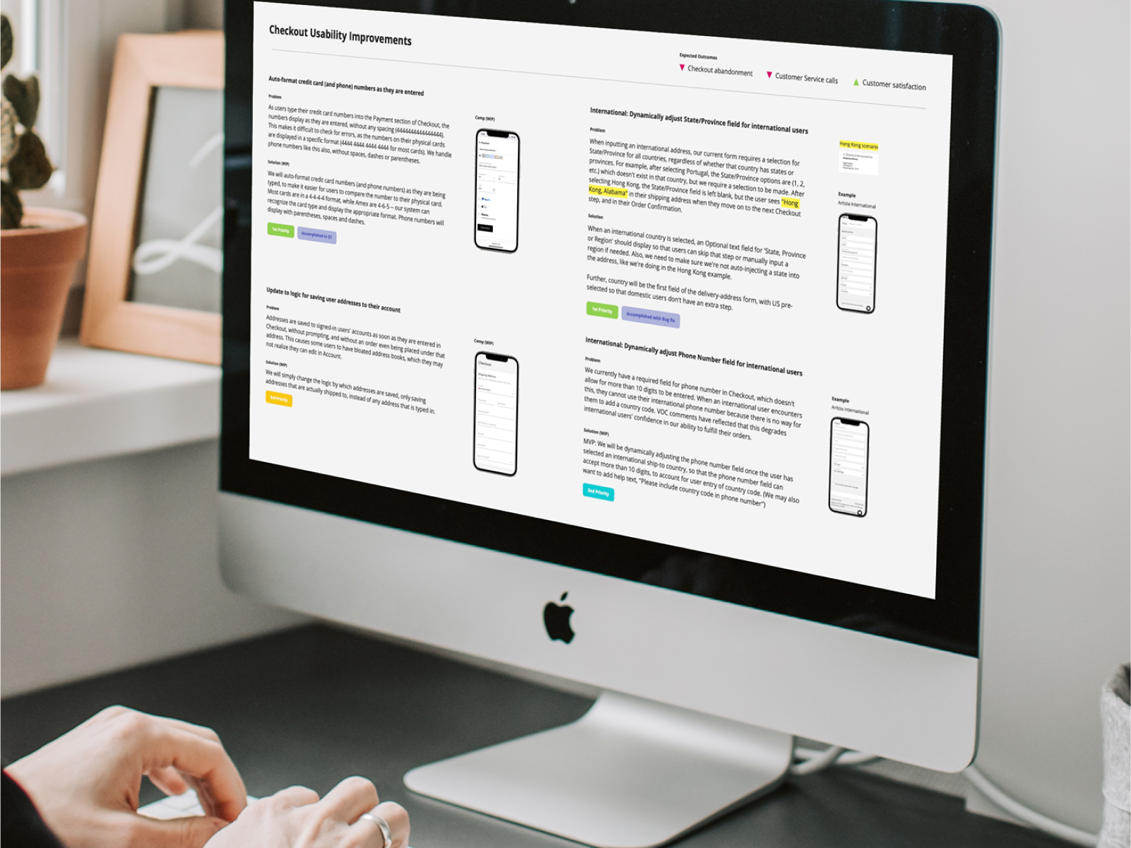
- 1 Shorter checkout: fewer steps, plus a guest option for first-timers
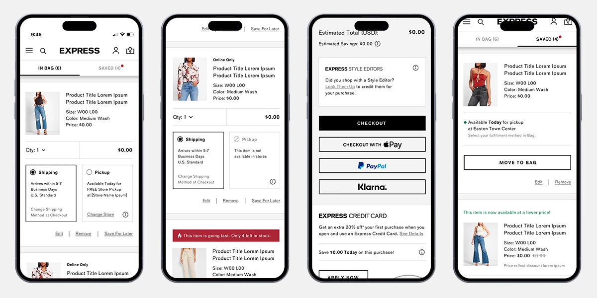
- 2 More ways to pay: digital wallets, PayPal, and installments
- 3 Live bag: prices and availability that update as things change
- 4 Smart add-ons: recommendations based on what's already in the cart
- 5 Mobile-first: rebuilt for the phone, since that's where people shop
Results
- A shorter, lower-friction checkout meant more carts actually reached "order placed"
- The new payment methods brought in sales the old flow simply couldn't capture
- A live-updating bag cut the second-guessing that led to abandoned carts
- Cart-aware recommendations nudged order values up
- The mobile rebuild paid off right where most of the traffic already was
Gallery
Click any image to expand
"Checkout work is unglamorous, but it's where the money is. Every step we removed was a few more people who finished what they started."