
Express
Product Detail Page Redesign
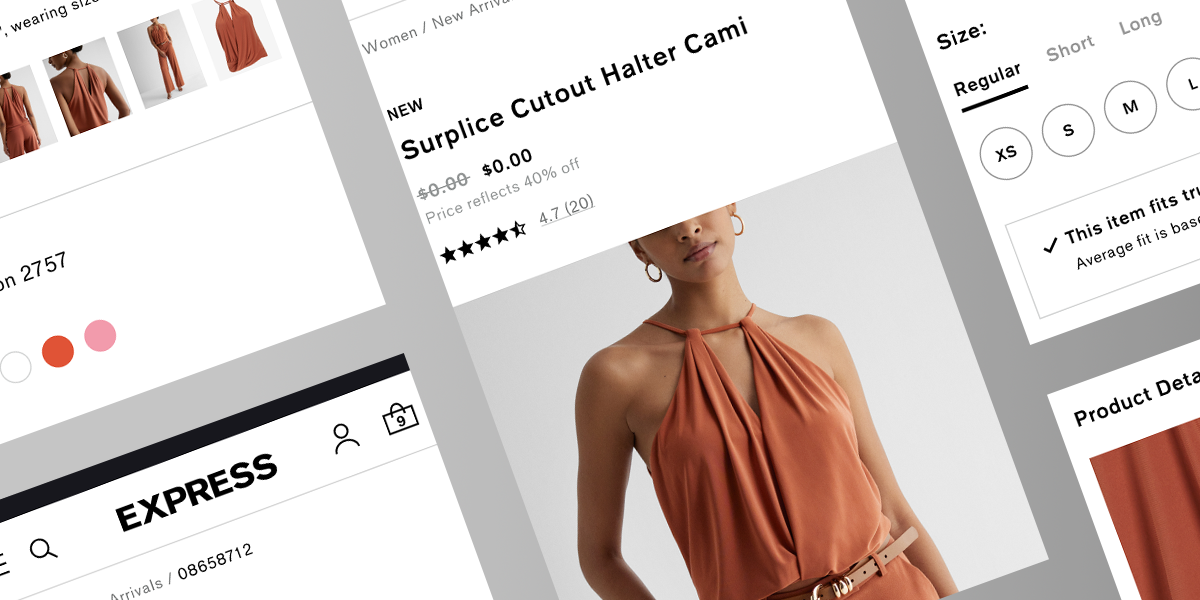
The product page is where Express either earns the sale or loses it, and ours was doing too much losing. I led the redesign with one goal: give shoppers enough to buy with confidence so fewer orders came back. That meant richer imagery, fulfillment options people could actually parse, and customer photos and reviews pulled to the front.
The Challenge
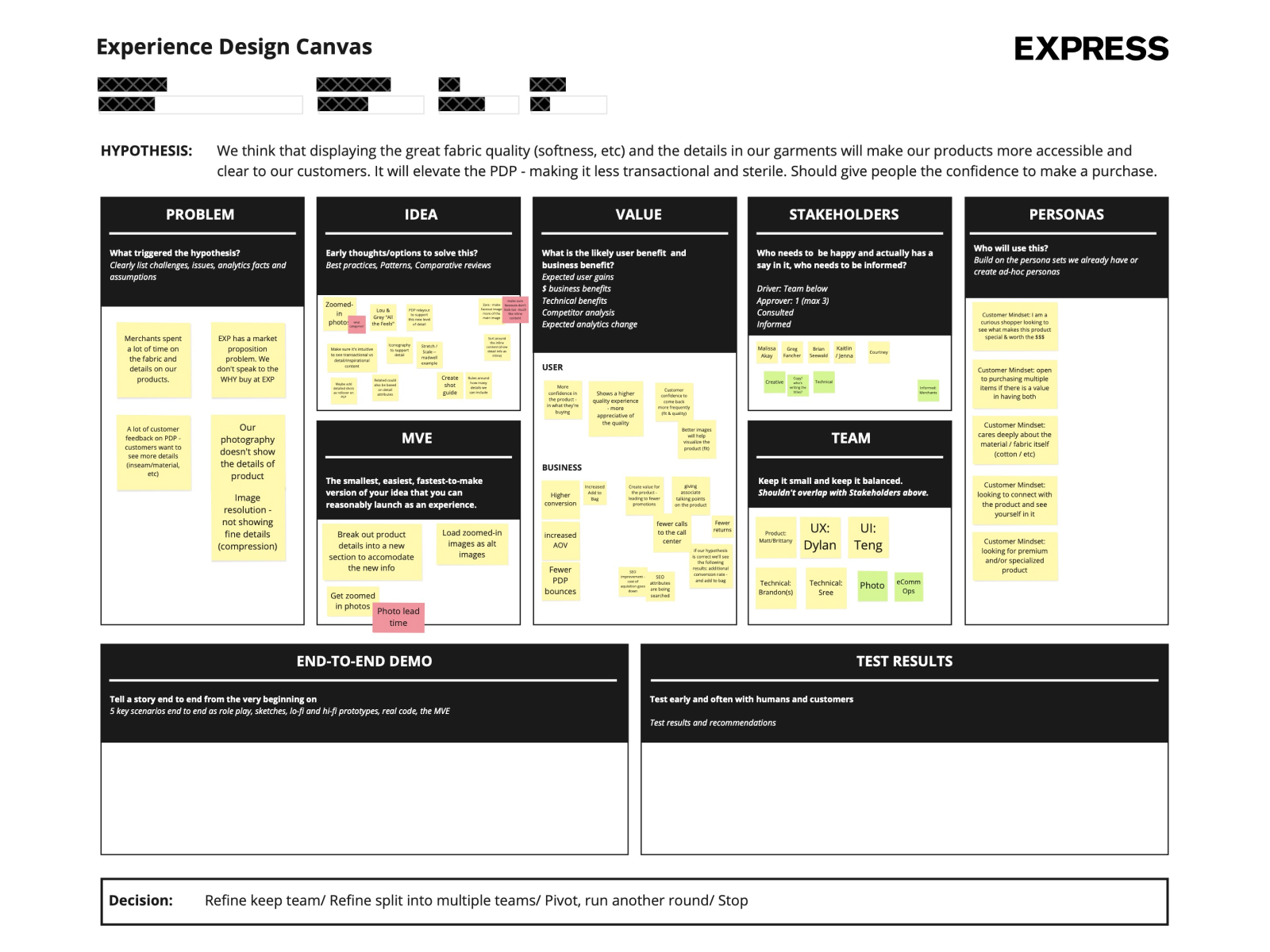
- Flat product photos hid the details that sell clothing, so people bounced or guessed
- Fulfillment options were confusing enough to lose shoppers at the worst possible moment
- With no customer photos, nobody could see how the clothes looked on real people
- Shoppers got no help picturing how a piece fit with the rest of their wardrobe
- Ratings and reviews were dated and static, so they did little to build trust
The Solution
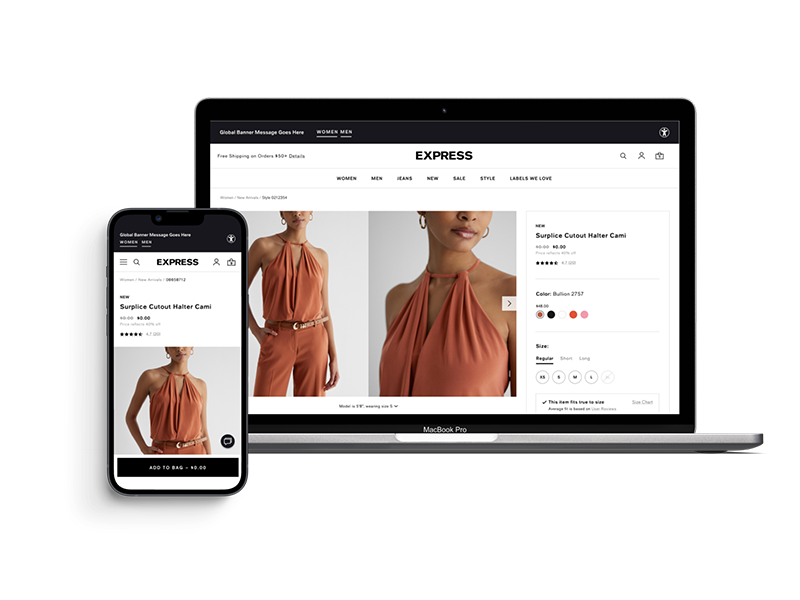
- 1 Image viewer with video: multiple angles, zoom, and clothes shown in motion
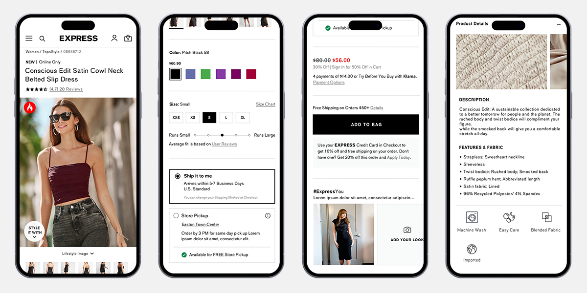
- 2 Simpler fulfillment: clear choices with live availability
- 3 Customer photos: shoppers upload their own styling shots
- 4 "How to Wear It": real outfit ideas built around each piece
- 5 Reworked reviews: filter by what matters, flag the helpful ones
- 6 Cleaner layout: less clutter, one consistent visual language
- 7 Close-up imagery: the fabric and fit detail you can actually see
Results
- People spent more time on the page once video and multiple angles gave them something to explore
- Clearer fulfillment cut the drop-off that used to happen right before checkout
- Customer photos and styling content gave hesitant buyers the push to commit
- The "How to Wear It" section pulled shoppers deeper into the catalog
- Showing the real product up front meant fewer "not what I expected" returns
Gallery
Click any image to expand
"The win here wasn't a flashier page. It was that people stopped second-guessing the buy, and stopped sending things back, because the page finally told the truth about the product."